As a content creator, I love the look and feel of “link in bio” pages.
They’re such an easy and mobile-friendly way to share various social medias and projects.
However, as a developer, I am frankly offended at the idea of needing a SAAS app to create a static page of links.
The idea of paying for such a service, or sharing my page with their branding is simply abhorrent.
Thankfully I have a Jekyll site and the ability to create <a> tags, so I’m able to avoid that dismal fate.❤️
Step 1 - Create a links page
Let’s create a new page in the /pages folder called links.html. We want html, because we’re going to be adding a lot of customizations.
---
title: Links
description: Social media and helpful links for ChaelCodes!
permalink: /links/
hide: true
---
We want a title for the tab title when it’s viewed in a browser. I’m happy with “Links” even though it’s not very descriptive. The description is what’ll show up in link previews on other sites. Our permalink will be the link they access. In my case it’ll look like chael.codes/links/ which is very slick.
hide: true.We didn’t define a layout, which means our page won’t have a header, footer, nor navigation, which is what we want! At this point, we have a blank page.
Step 2 - Strip out navigation and footer
Chances are high that your default layout has a header and footer. We need to make a new layout called “empty” to strip those out. We still want all the meta info that’s in your head - this controls livereload, fonts, scss styling (which we’ll add later), and more!
<!DOCTYPE html>
<html lang="en">
  {% include default/head.liquid %}
  <body>
    {{ content }}
  </body>
</html>
---
title: Links
description: Social media and helpful links for ChaelCodes!
permalink: /links/
layout: empty
hide: true
---
Step 3 - Define social links
Jekyll supports collections which are site data stored in yml files. These are parsed by Jekyll and make it easy to iterate over structured data.
links:
  - title: Twitch
    link: https://twitch.tv/ChaelCodes
    icon: fa-twitch
  - title: YouTube
    link: https://youtube.com/c/ChaelCodes
    icon: fa-youtube
  - title: GitHub
    link: https://github.com/ChaelCodes
    icon: fa-github
You can easily add and remove links by modifying the yml file, and there’s less danger of introducing mistakes due to copy/pasting.
My site theme supports font awesome icons, which is why mine are all fa-github or fa-<whatever> but obviously, you can use the icon library of your choice.
Step 3 - MAKE SOME LINKS
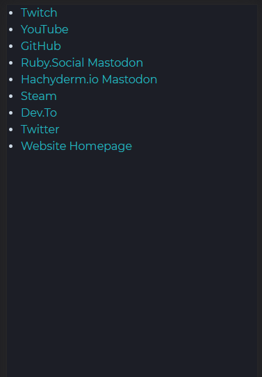
LET’S ADD SOME <a> TAGS!
<ul>
{% for social in site.data.social.links %}
  <li>
    <a href="{{social.link}}">{{social.title}}</a>
  </li>
{% endfor %}
</ul>
IT’S MAGNIFICENT!
We’re done! Everyone can access my links now! 🙌
Step 4 - Add some buttons
We’re going to add an id to that ul to isolate it from other content on our site, then we’ll create an scss file - links.scss for our styling!
@import 'pages/links';
<ul id="links">
/* --- links page styling -- */
#links {
  list-style-type: none;
  margin-left: 0em;
  font-family: $font-family-headings; // override text to use heading text instead of body

  li {
    a {
      display: block;
      margin: 1em 2em;
      padding: $padding-small;
      text-align: center;
      background-color: var(--vivid-color-1);
      color: white;
    }
  }
}
It’s plain, but not we have a links page with a list of buttons!
Step 5 - Add a friendly face to the links page
I think it’s really helpful to give people a little greeting and show them your avatar to reassure them that they’ve ended up on the right page.
  <div id="links-profile">
    <img id="avatar" src="/assets/img/profile_pic.jpg" alt="profile pic of Chael smiling and wearing fib shawl"/>
    <p>To be honest, I can't keep track of all the places I'm active either.</p>
  </div>
  #links-profile {
    #avatar {
      border-radius: 50%;
      border: .2em solid var(--vivid-color-2);
      width: 50%;
      margin: 1em auto;
      display: block;
      padding: 0;
    }

    p {
      text-align: center;
    }
  }
This is probably enough, right?
Step 6 - Fix desktop view
Let’s just pop into desktop view for a fun screenshot!

That’s not ideal.

Let’s give this page a maximum width and center it!
<div class="column">
  <div id="links-profile">
    <img id="avatar" src="/assets/img/profile_pic.jpg" alt="profile pic of Chael smiling and wearing fib shawl"/>
    <p>To be honest, I can't keep track of all the places I'm active either.</p>
  </div>
  <ul id="links">
    {% for social in site.data.social.links %}
      <li>
        <a href="{{social.link}}">{{social.title}}</a>
      </li>
    {% endfor %}
  </ul>
</div>
.column {
  max-width: 500px;
  margin: 0 auto;
}
And now we have a perfectly functional and pleasant links page built in Jekyll!
Step ∞ - Entirely Unnecessary Futzing to impress other developers
These are all going to be links to commits. You can see the result on my links page. I’ll add any additional futzing I do to this list.


